Flu, or "Flu Related" mortality.
"Why does the CDC estimate deaths related to seasonal flu?"

From the MMWR:
“CDC does not know the exactly the number of people who die from flu each year"
“CDC feels (?) it is important to convey the full burden of seasonal flu to the public.”
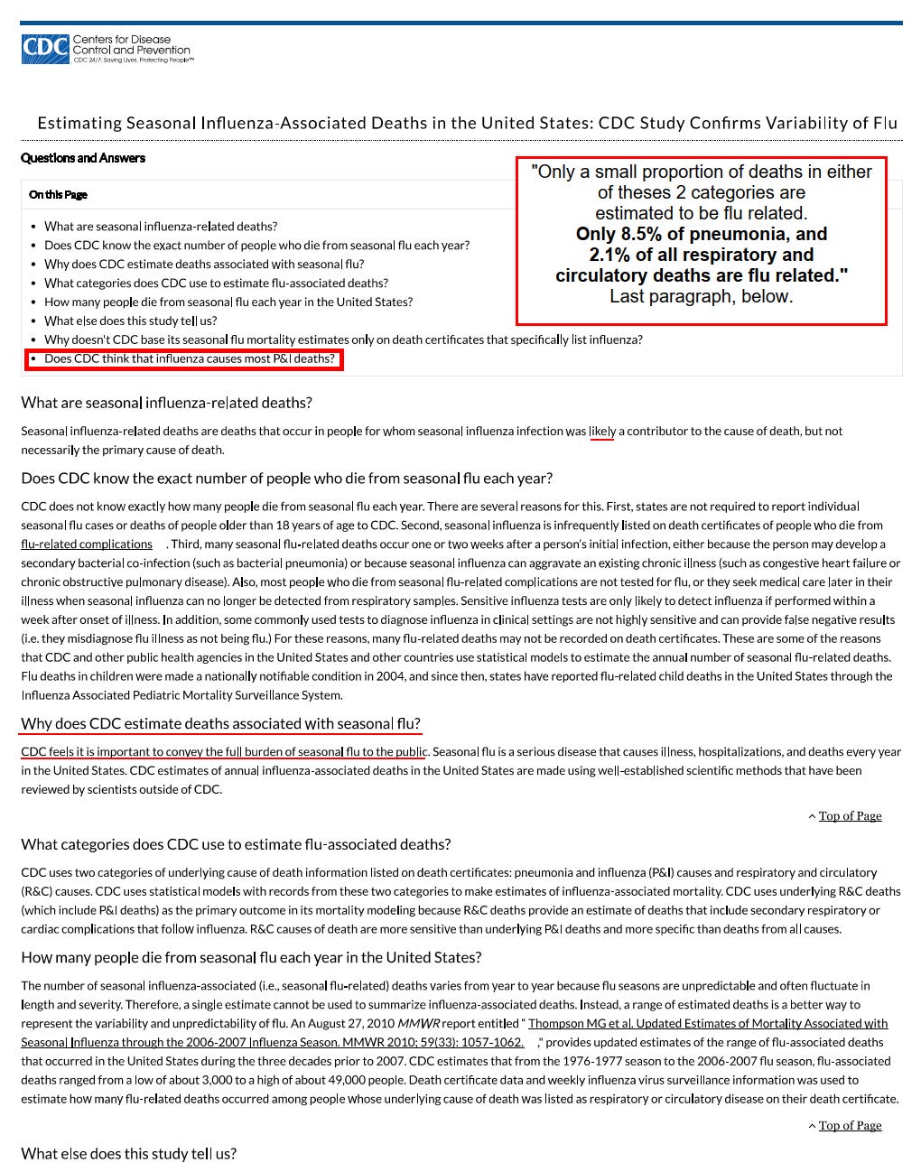
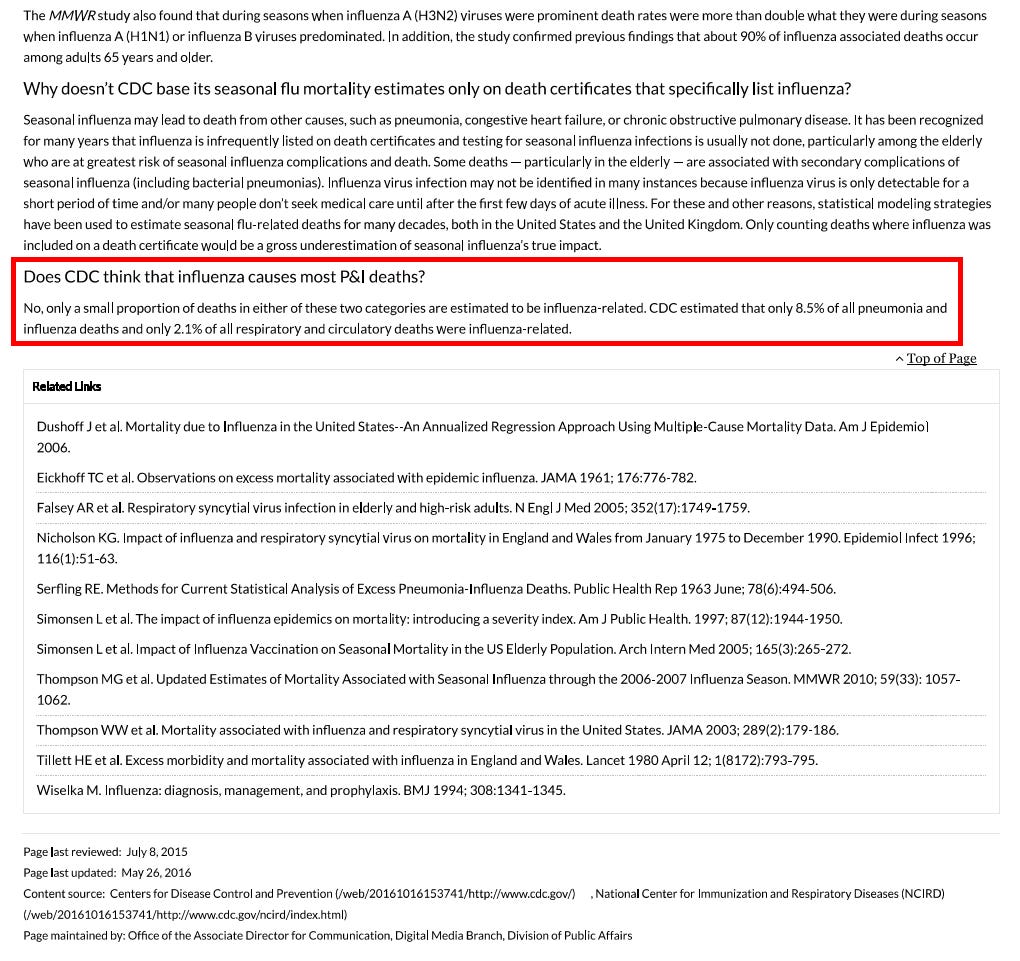
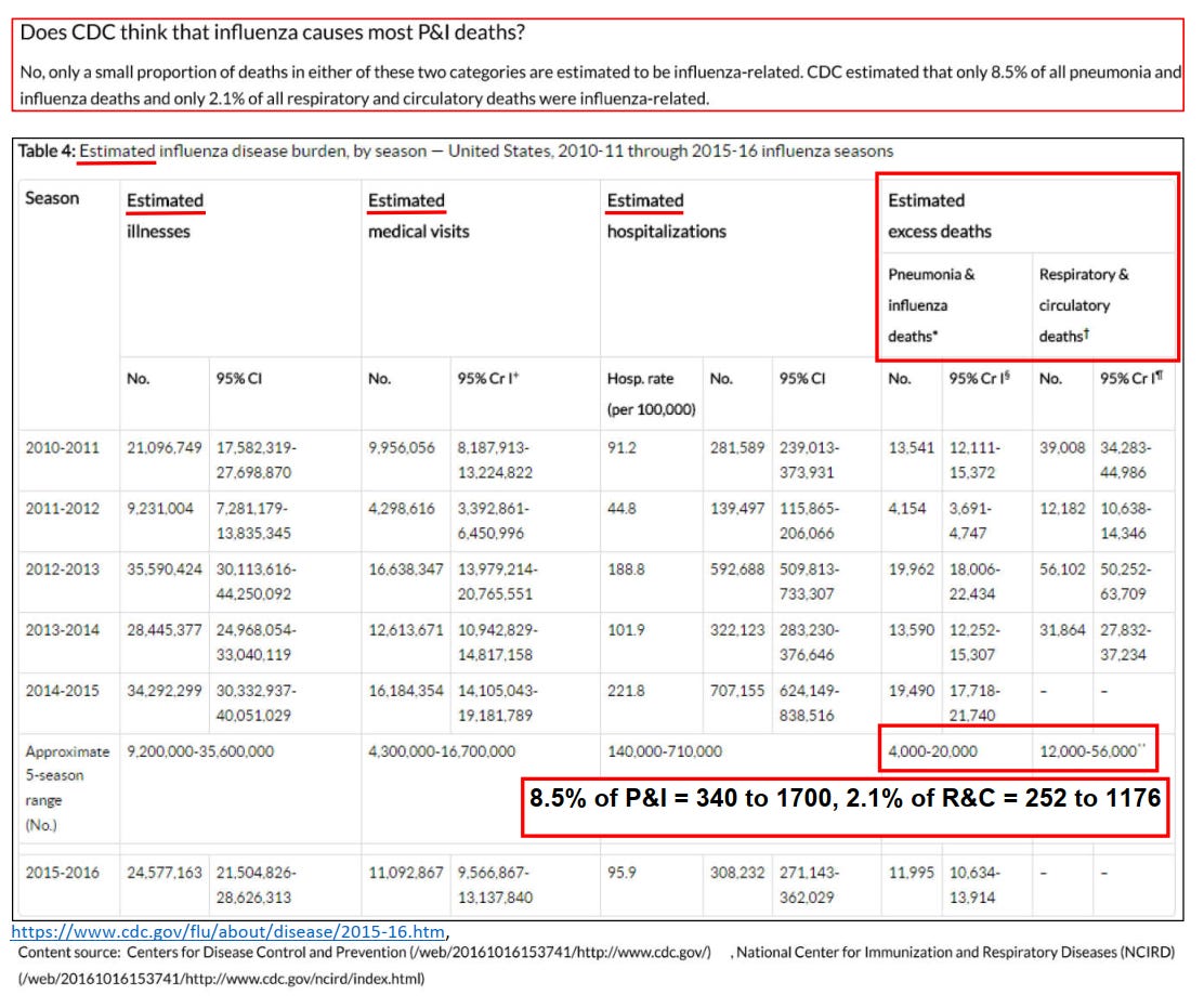
“Does the CDC think that influenza causes most P & I deaths?”
“Only a small proportion of deaths in either of these 2 categories are estimated to be flu related.”
“Only 8.5% of pneumonia, and 2.1% of all respiratory and circulatory deaths are flu related.”
COMMENTARY:
Flu — or Flu Related?
How a statistical trick turned a mild virus into a perennial mass‑death narrative
If forty thousand Americans really died of the flu every year, everyone would know someone.
A coworker. A neighbor. A cousin.
But most people can’t name a single one.
Yet every winter, health officials and media headlines remind us: “Up to 40,000 people die from the flu each year.”
It’s a line so familiar that few ever stop to ask a simple question — where does that number come from?
What “flu‑related” actually means
Buried in an official CDC document, quietly updated in 2016, lies a revealing disclaimer:
“Only 8.5 % of pneumonia deaths and 2.1 % of respiratory and circulatory deaths are estimated to be influenza‑related.”
In other words, about 98 % of the deaths counted as “flu‑related” aren’t influenza at all — they belong to enormous statistical categories whose winter increases simply coincide with flu season.
The agency doesn’t actually count flu deaths in adults.
Instead, it models them, using regression formulas that treat seasonal spikes in heart failure and pneumonia deaths as signals of invisible influenza.
When “flu‑like” isn’t flu
Laboratory surveillance reveals the same pattern. Between 1997 and 2014, the CDC tested millions of respiratory samples from Americans reporting “flu‑like illness.”
The numbers tell their own story:
Season range Avg. samples positive for influenza 1997 – 2014 ≈ 15 %
Meaning: roughly 85 % of people with “flu‑like” illness didn’t have influenza virus at all.
They had rhinovirus, RSV, adenovirus, bacterial bronchitis — anything but “the flu.”
The real death certificates
Data compiled by the American Lung Association — drawn from CDC mortality files — paints an even sharper picture.
Between 1999 and 2006, annual influenza‑coded deaths ranged from 257 to 1 812, averaging roughly 1 200 per year.
That’s a rounding error next to the “40,000 deaths” cited in campaigns every winter.
Even the 2016 CDC paper acknowledges that > 90 % of truly influenza‑associated deaths occur among seniors ≥ 65 years, the very group for whom vaccine efficacy is lowest.
The math behind the myth
So how did 1,200 actual deaths become 40,000 “annual flu deaths”?
Through what epidemiologists call the Serfling regression model — a statistical method from the 1960s that estimates “excess winter mortality.”
Here’s the trick:
Analyze baseline deaths in summer when flu activity is minimal.
Subtract that baseline from winter deaths.
Attribute the unexplained difference to “influenza.”
Thus, if 60,000 more people die in January than in July, and only a few thousand are confirmed flu cases, the model still credits tens of thousands of those excess deaths to influenza — sight unseen.
The result is mathematically elegant and empirically hollow.
Why the exaggeration persists
Numbers shape policy — and budgets.
The bigger the burden, the greater the justification for vaccine funding, advertising, and emergency stockpiles. No agency willingly admits it has overstated danger for decades.
And for journalists accustomed to quoting press releases, “flu kills 40 000 people” is easier copy than dissecting statistical models.
It keeps the wheel turning: fear ↔ funding ↔ reinforcement.
The linguistic sleight of hand
Notice how public‑health language fuses flu and flu‑related into one rhetorical blur.
“Flu or flu‑related complications” sounds precise — but it’s a semantic loophole wide enough to drive policy through.
The modifier “‑related” performs the heavy lifting, transforming correlation into causation, modeling into mortality.
When counting stopped, modeling began
Until the early 2000s, CDC published the raw influenza death numbers straight from the National Vital Statistics System.
Once those figures proved too small to justify mass vaccination narratives, the practice shifted: real counts vanished; modeled estimates replaced them.
The “flu season toll” became an annual press release ritual, detached from laboratory confirmation.
The truth hiding in plain sight
If the yearly toll were truly 40,000, you would already know someone who’d died of flu.
But you probably don’t — because the real figure, according to the government’s own data, is closer to one or two thousand, not forty.
Every other “flu death” exists only as a probability inside an algorithm.
Public trust doesn’t die from influenza; it dies from the word “related.”
References to hyperlink for readers
CDC (2016): Estimating Seasonal Influenza‑Associated Deaths
[archived source: web.archive.org/web/20161016153741/http://www.cdc.gov/flu/about/disease/2015‑16.htm]CDC Weekly Influenza Surveillance Reports, 1997–2014
American Lung Association, Trends in Pneumonia and Influenza Morbidity and Mortality (2010) https://www.lung.org/getmedia/98f088b5-3fd7-4c43-a490-ba8f4747bd4d/pi-trend-report.pdf.pdf
The math behind the myth.
“Excess‐Mortality Modeling in 30 Seconds”
The CDC’s influenza death estimates come from a Serfling regression, first described in 1963.
Here’s the layman’s version:
Define a baseline – Use deaths from non‑flu months (summer) to predict how many deaths should occur each week if influenza weren’t present. Call that the expected line.
Measure the winter peak – Count all “respiratory + circulatory” deaths each week.
Subtract the baseline from the observed peak – The leftover “extra” deaths are labeled influenza‑associated.
Mathematically:
Flu‑Associated Deaths = Observed R&C Deaths − Expected Baseline
That’s it. No lab verification — just subtraction.
If January’s respiratory + cardiac deaths rise 10 %, the model assumes influenza caused the entire difference, ignoring cold weather, vitamin D dips, hospital staffing gaps, dietary changes, or other seasonal biological stresses.
Simple visual metaphor
Imagine a city where 1,000 people normally die each summer month.
In January, 1,100 die.
The model assumes all 100 extra deaths were from flu — even if no one was tested.
Scale that to the U.S. and you now understand how “40 000 flu deaths” appears every year — an elegant equation standing on missing data.
The algebra made visible.
One curve, one assumption, forty thousand deaths.
Micro‑Chart: How “Excess Mortality” Becomes “Flu Deaths”
Deaths per week
│
│                         *
│                        * *           <-- observed respiratory + circulatory deaths
│                       *   *
│                      *     *          \
│                     *       *          \
│          baseline --•-------•-----------•-------•--
│                   summer   autumn      winter   spring
│
│<-- baseline (expected) -->|<--- "excess" called 'influenza-associated' --->|
KEY:
The baseline line (• • •) is the expected number of deaths during non‑flu months.
The peaks (*) represent the observed winter rise.
The shaded area (“excess”) between them is automatically labeled “influenza deaths,” regardless of lab confirmation.
So, if baseline = 1,000 deaths/week and winter peaks at 1,150, the model attributes 150 deaths/week to influenza, even if no virus was detected.
“Flu — or Flu Related?”
The bottom line
For two decades, editors and agencies have recycled the same number — “40 000 flu deaths” — until it became cultural wallpaper. But data never confirmed it. The illusion persists because models replaced measurement, and words like “flu‑related” blurred the boundaries between correlation and cause.
The CDC’s own methods show that only a few thousand Americans each year actually die with laboratory‑confirmed influenza on their death certificates. The rest is a phantom created by regression curves and seasonal coincidence.
Why it matters
When science drifts from observation into assumption, public trust erodes. If officials exaggerate something as routine as influenza, how can citizens weigh risk honestly when the next crisis arrives?
Transparency isn’t a threat to public health — it is public health.
The CDC’s handling of influenza mirrors its current “measles math.”
In the same way that flu‑related deaths turn excess seasonal mortality into influenza fatalities, the label unvaccinated and unknown collapses two unrelated categories into one convenient headline. In both cases, ambiguity is rebranded as data.
I dislike to sub‑grub, but even a piece like this — revisiting research I first did in 2015 — takes many hours to assemble. Every line must be near‑perfect, because while public‑health spokesmen can shrug off their errors, a single discrepancy in criticism is treated as total discredit.
I have enough material to publish much more frequently, but real research and clear writing need time — and support.